
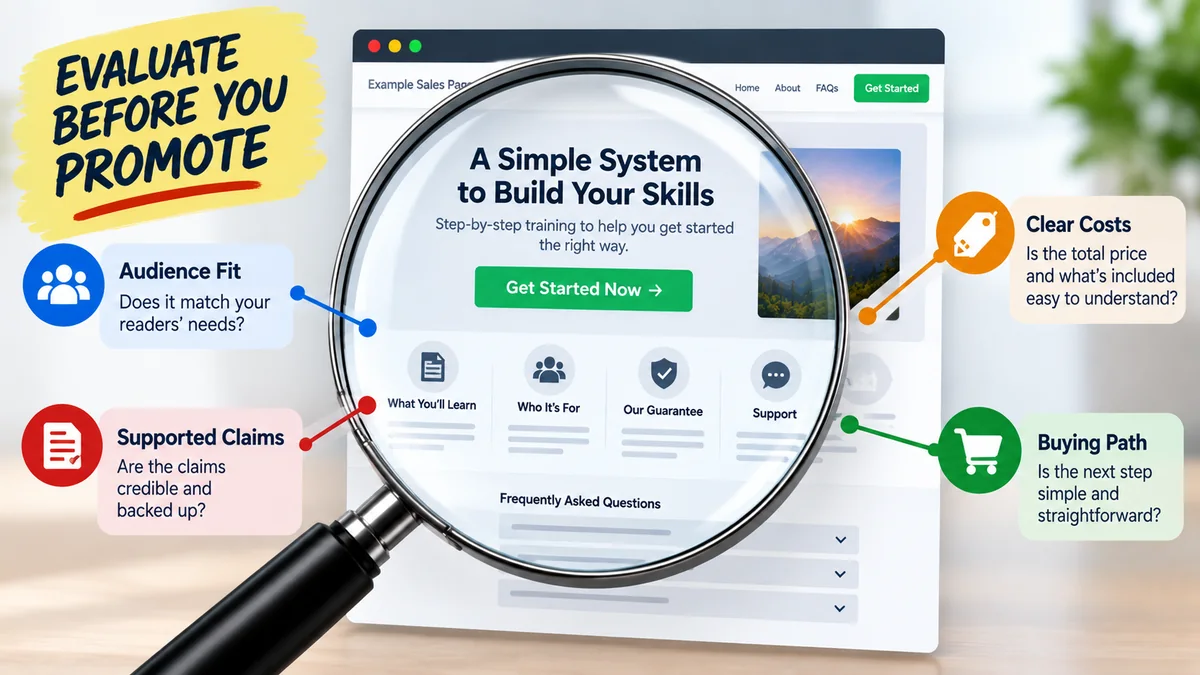
Before promoting an affiliate offer, examine the sales page your visitors will actually see. Learn how to assess message match, clarity, claims, trust, usability, and the path to purchase.
An affiliate can do many things well and still struggle if the page visitors reach after clicking does not match what they expected.
That is why evaluating an affiliate sales page should happen before you spend meaningful time or money sending traffic to an offer.
You are not trying to predict with certainty whether a sales page will convert. You are checking whether the page creates a sensible continuation of the visitor’s journey.
Does it match the promise that brought the visitor there? Is the offer understandable? Are the claims believable? Can someone use the page comfortably on a phone? Is the next step clear?
Those questions can reveal problems that affiliate-network statistics alone cannot show you.
In many affiliate campaigns, you control the traffic source and the content that earns the click, but you do not control the vendor’s sales page.
That creates an important handoff.
Your article, advertisement, email, or other promotional content establishes an expectation. The sales page then has to continue the conversation.
If the visitor clicks because they expect one thing and immediately encounters something very different, that disconnect can weaken the experience before they have had time to evaluate the offer.
This is sometimes called message match: the ideas, positioning, and expectations before the click should make reasonable sense when compared with what appears after the click.
Imagine an article helps a beginner understand a simple solution to a specific problem.
The reader clicks to learn more.
If the destination page suddenly uses aggressive claims, speaks to a completely different audience, or focuses on a different problem, the transition can feel confusing.
Before promoting an offer, compare the sales page with the traffic you plan to send.
Ask:
This is one reason understanding buyer intent matters. A visitor who is still learning may respond differently from someone who is actively comparing possible solutions.
Do not evaluate a sales page only from its headline.
Read enough of the page to understand exactly what the customer receives.
Look for basics such as:
If you cannot clearly explain what is being sold after reviewing the page, a new visitor may have the same problem.
A confusing offer is harder to describe accurately in your own content as well.
A sales page can contain a lot of information without being clear.
Try to identify its central message:
What does this offer claim to help the customer do, understand, obtain, or solve?
Then look at how consistently the rest of the page supports that message.
Warning signs can include:
A visitor should not need detective work to determine what the offer is about.
Sales pages are designed to persuade, but persuasion does not remove the need for accurate claims.
The Federal Trade Commission explains that advertisers should have a reasonable basis for objective advertising claims before those claims are made. The FTC also notes that health and safety claims generally require particularly strong substantiation.
You can review the FTC’s Advertising FAQs for Small Business for its general guidance on advertising claims.
As an affiliate evaluating a page, you may not have access to the vendor’s internal evidence. That makes it especially important not to automatically repeat dramatic claims simply because they appear on the sales page.
Be cautious when you see statements involving:
The FTC’s broader Health Products Compliance Guidance also emphasizes that marketers must consider both express and implied claims and have adequate support for objective health-related representations.
You do not need to become the vendor’s compliance department. But you should take seriously what you are asking your audience to trust.
When evaluating an offer you hope to promote, it is easy to look for reasons to like it.
Try the opposite.
Read the page as someone who has never heard of the product and has no reason to trust it yet.
Ask:
This simple change in perspective can reveal issues that are easy to overlook when you are focused mainly on commission potential.

A sales page can be well made and still be wrong for your audience.
Suppose your content primarily helps beginners.
If the offer assumes advanced knowledge, requires expensive supporting tools, or uses terminology your readers are unlikely to understand, the match may be weak even if the product itself is legitimate.
Consider:
An offer does not need to appeal to everyone. It needs to make sense for the audience you are actually reaching.
Do not evaluate the sales page only from a desktop monitor.
Open it on a phone or use a reliable mobile preview and inspect the experience.
Look for:
If your traffic includes mobile visitors, a frustrating mobile experience can affect the campaign regardless of how attractive the page looks on desktop.
Do not stop your evaluation at the main sales page.
Follow the visitor’s path as far as you reasonably can without making an unnecessary purchase.
Check what happens when someone clicks the primary call to action.
Look for:
The sales page is only one part of the customer path.
A polished first page does not compensate for a confusing checkout experience.
Affiliate marketers sometimes spend time building content around an offer without verifying the simplest part: whether the path actually works.
Before sending traffic:
This should also become part of your ongoing workflow because vendors can update pages, change URLs, or modify their funnels after you begin promoting them.
A repeatable affiliate marketing workflow can make checks like these easier to incorporate without relying on memory.
A visitor should understand what the page wants them to do next.
That does not mean the page needs enormous buttons every few inches.
It means the action should make sense in context.
Ask:
A call to action should support the buying process, not create another puzzle.
Sales pages often include elements intended to build confidence.
These may include:
These elements can help a visitor understand the business, but their presence does not automatically prove that every claim on the page is accurate.
For example, testimonials describe individual experiences. They should not automatically be treated as objective evidence that everyone will receive the same result.
Every unnecessary obstacle gives the visitor another reason to stop.
Watch for friction such as:
Not every long sales page is bad, and not every short page is good.
The more useful question is whether the length and structure help the visitor understand the offer.
The same sales page may perform differently depending on where visitors come from.
A person who reaches an offer after reading a detailed educational article has received more context than someone who clicked a short advertisement.
Likewise, paid search visitors may have different expectations from social visitors or email subscribers.
Before promotion, ask what information your traffic source provides before the visitor reaches the sales page.
If you are still deciding between acquisition approaches, our guide to free vs paid traffic for affiliate marketing explains some of the important differences.
Visual polish can create a strong first impression, but design is only one part of evaluation.
A professional-looking page does not automatically mean:
Likewise, a simpler page should not automatically be rejected if it communicates the offer clearly and appropriately.
Evaluate the complete opportunity rather than letting visual design make the decision by itself.
Your promotional content should not promise more than the destination can reasonably support.
If your article is educational and measured, but the sales page makes aggressive promises, decide whether you are comfortable directing your audience into that experience.
The reverse can also happen.
If your own promotional material exaggerates the offer while the vendor page is more restrained, the mismatch was created before the click.
Our guide on writing affiliate content that helps before it sells explains why useful pre-click content should serve the reader instead of merely pushing them toward an offer.
Affiliate-network statistics can provide useful clues about activity around an offer, but those metrics do not replace reviewing the destination yourself.
A number cannot tell you whether:
Use quantitative data and qualitative evaluation together.
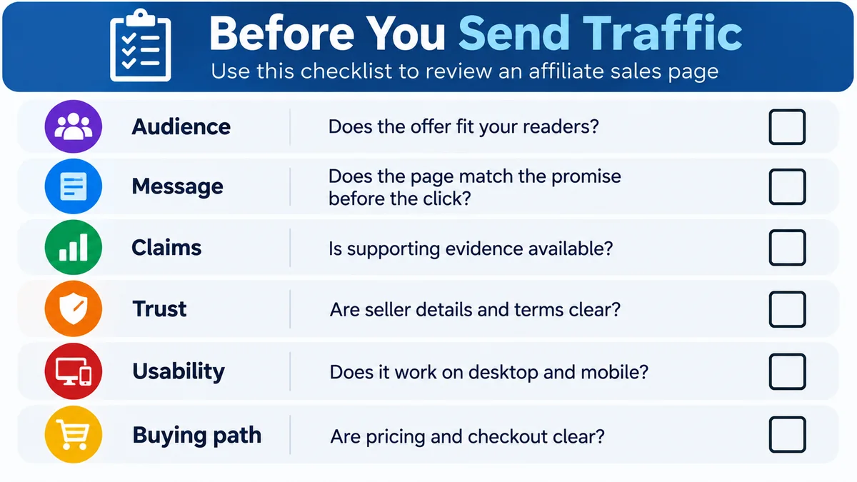
You can make offer evaluation more consistent by reviewing the same basic factors each time.
Before sending traffic, check:
A careful review can help you avoid obvious mismatches, but it cannot tell you exactly how real visitors will respond.
That requires actual data.
Once an offer has passed your basic evaluation, begin with a controlled test that matches your budget and traffic strategy.
Choose the metric you intend to evaluate before changing multiple parts of the campaign.
Our guide to testing an affiliate campaign without changing everything at once explains why changing one meaningful variable at a time can make the results easier to interpret.
A weak initial result does not automatically prove the sales page is the problem. Traffic quality, targeting, pre-click messaging, offer fit, tracking, and other factors can all influence what happens.
That is why page evaluation and campaign testing should work together rather than being treated as the same thing.
Evaluating an affiliate sales page is not about deciding whether you personally like the design.
It is about determining whether the page makes sense for the audience and traffic you plan to send.
Look at the message match. Understand the offer. Examine the claims. Read the page skeptically. Test the mobile experience. Follow the buying path. Check the links. Consider whether your own content can introduce the offer accurately.
Then use real campaign data to learn what happens when qualified visitors actually reach the page.
That process will not guarantee that an offer performs well, but it gives you a much stronger basis for deciding what deserves a test than simply choosing an offer and hoping the destination does the rest.
Subscribe to get the latest posts sent to your email.
If you found this guide helpful, please tap the Like button and share it with someone who could benefit. Every Like and Share helps more people discover Partner to Wealth.